Scientifically Breaking Barriers to Provide Relief

Client's Request
----------

The owners of Biological MD Solutions wanted to launch their topical pain relief cream and needed a strong brand to truly represent it and differentiate it in the market.
OVERVIEW
Skagga worked with the client on brand naming, styling, and messaging to build a company around the pain relief cream ready to go to market.
Services Provided & Deliverables
----------
Branding
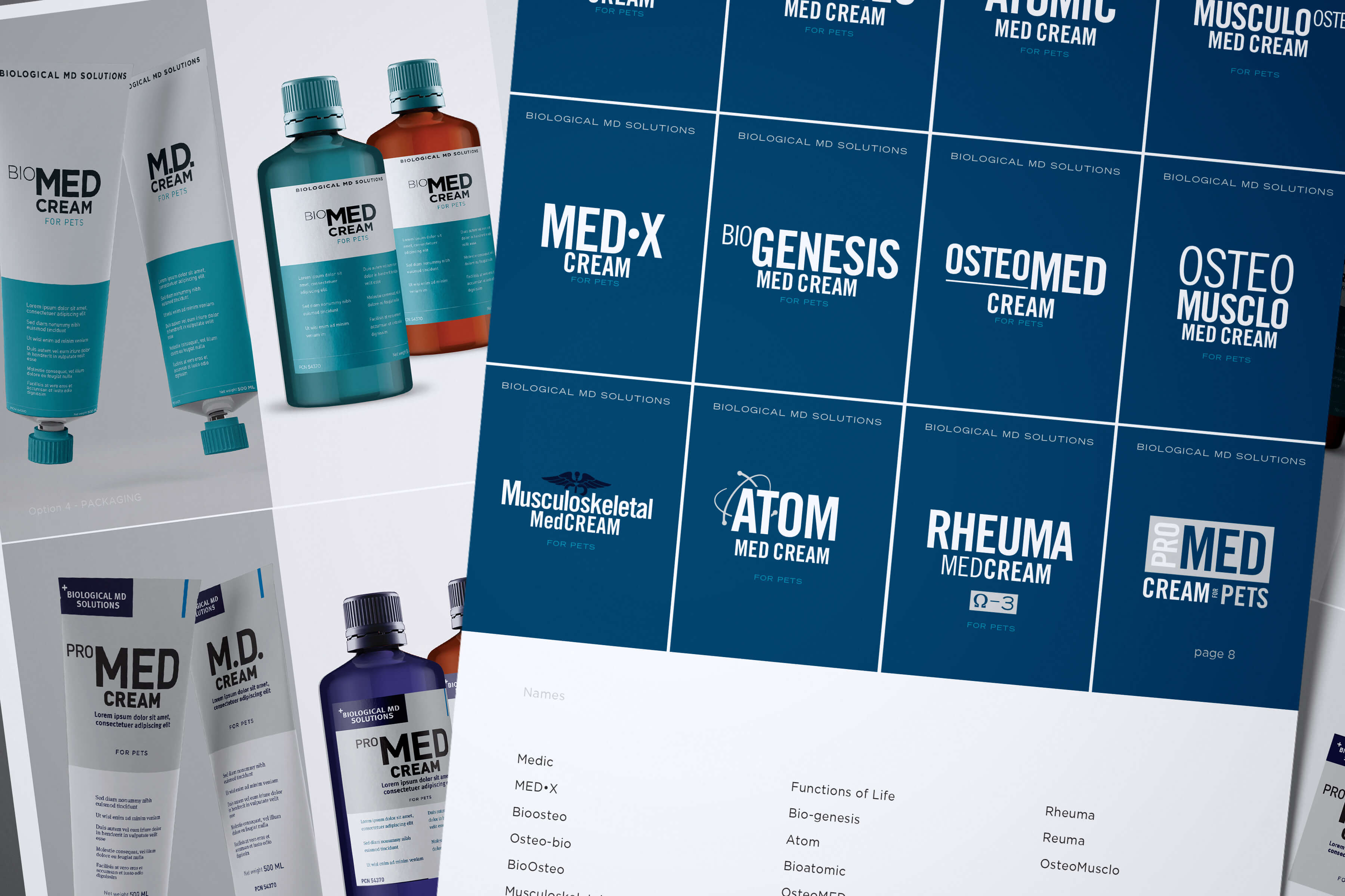
Through a series of interviews, research, benchmarking, and analysis Skagga provided consultation and recommendations on branding. Several factors were considered to amalgamate the client’s preferences, identity, modern design, and targeted demographics.
The brand mark went through several rounds of iteration to hone in to solidify client preferences, reflect key aspects of the product, and effectively target and communicate to end-users
Package Design
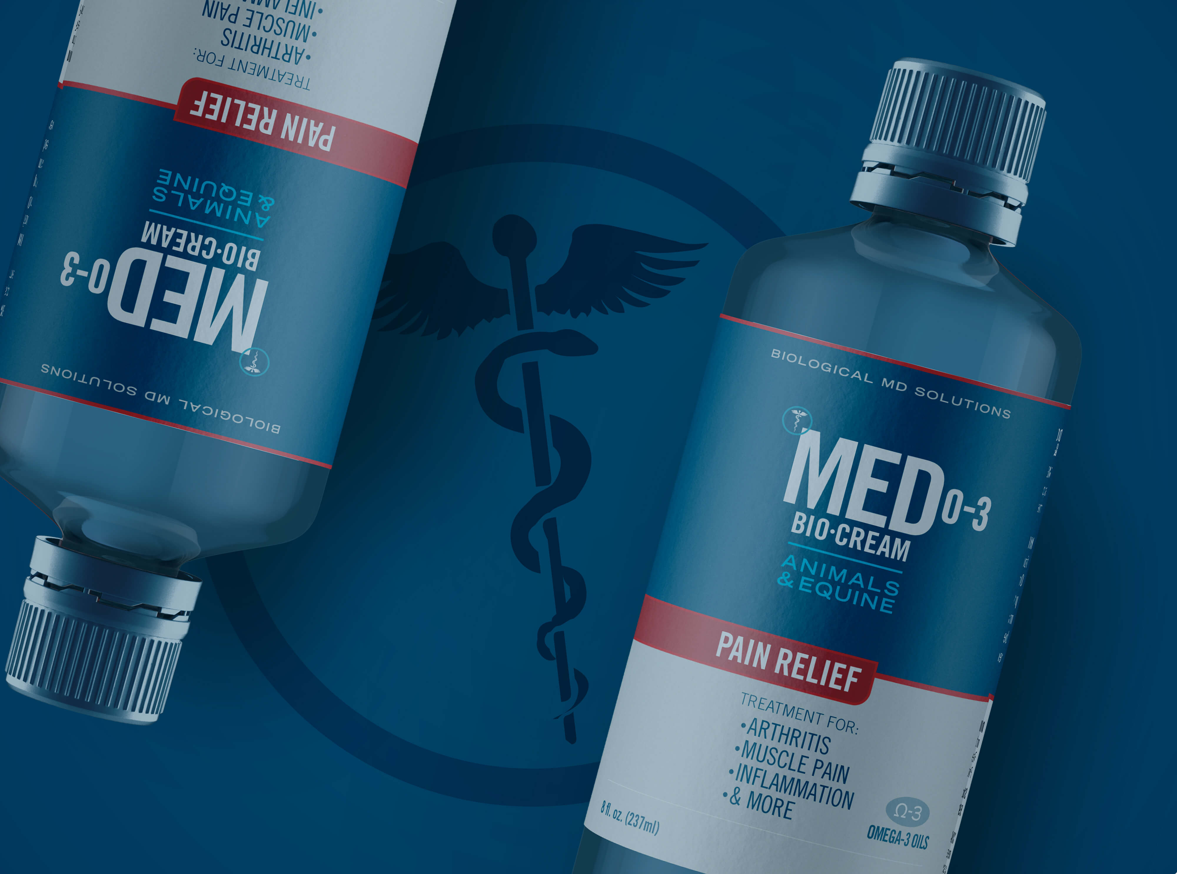
The package design was designed in such a way as to stand out from the competition and not be overly ‘salesy’. We wanted to communicate science, honesty, and results vs. some slick advertising that yells for attention but is often perceived as a gimmick. It was important that the consumer would quickly interpret the package design as straightforward and medical grade. Several factors were incorporated to align with the FDA labeling requirements.
Website Development & E-Commerce
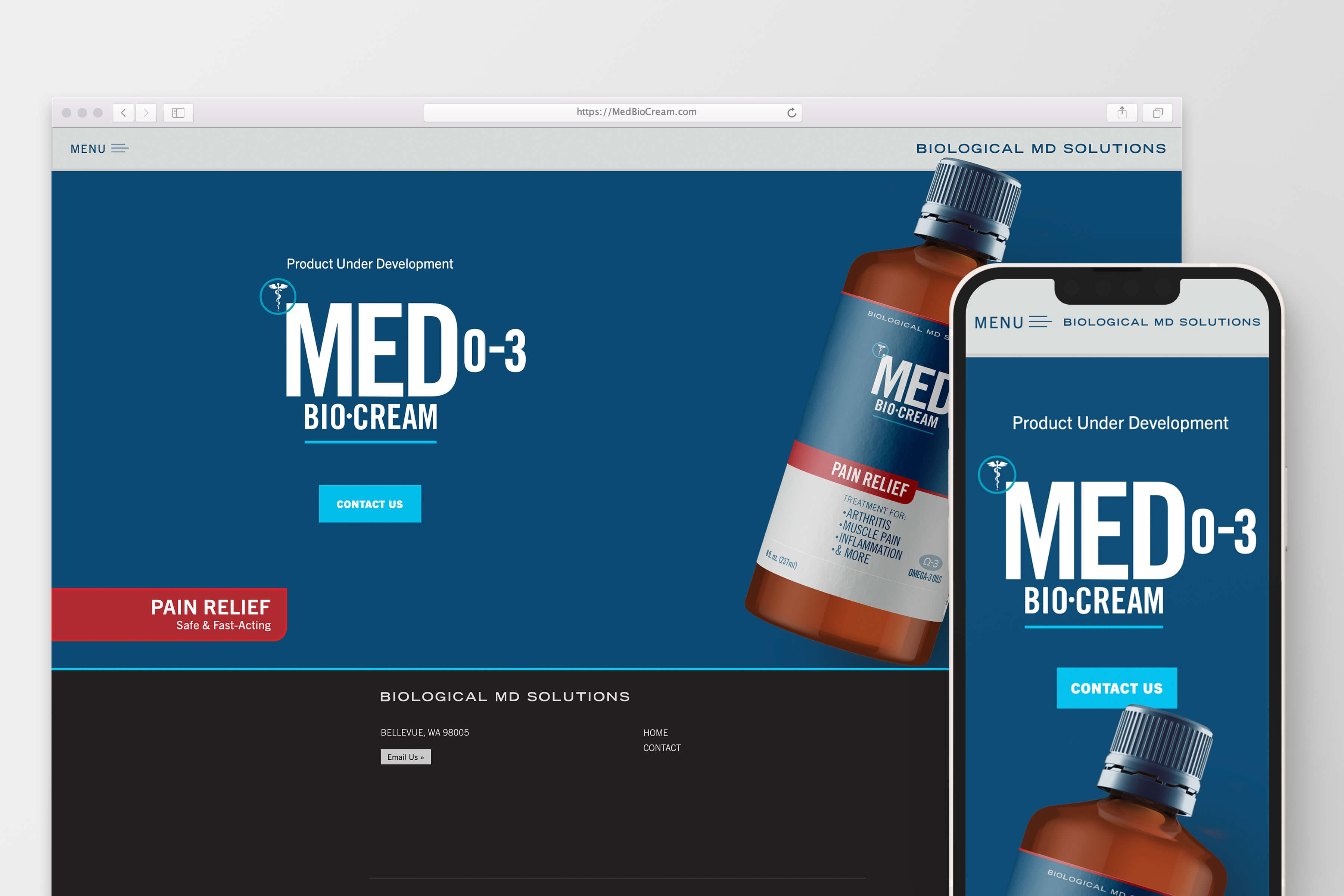
The website design followed the same branding protocol set. The website was custom designed to be organized systematically with the science and biological basis driving the content. All of it was then refined and presented in a modern way, making it easy to navigate and learn about the benefits of the pain relief cream.